Kazuto Nishimori

Hello! I am a 2021 graduate from Middlebury College with a degree in Physics, Geography, and French. I am interested in cartography, design, spatial analysis and data visualization.
I was born in Tokyo and split my time between there and Brookline, MA until high school. Then, I moved to the beautiful Middlebury College nested between the Adirondacks and Green Mountains. Some of my hobbies include homebrewing, carpentry, and darkroom photography.
LinkedIn
Webmaps
Flickr Photo Density Map
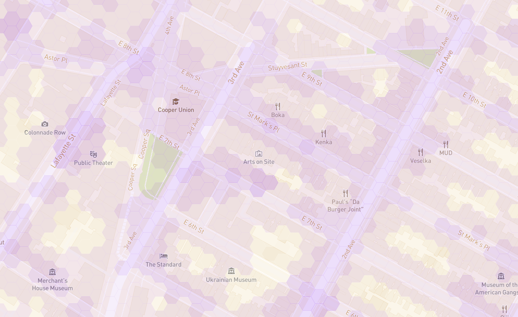
Using Flickr’s API, I counted every instance of a geotagged photo in Tokyo and Manhattan and mapped them using a dynamic hex-grid choropleth map. Choropleth maps are used to map everything, from election predictions to Covid cases to the racial make up of a city. However they have a two fundamental flaws that misguide and deceive the reader: 1) large geographic areas carry more visual weight (e.g. a US election map is way more red than blue by area) and 2) classification (numbers at which color breaks happen) can be used to tell completely different stories. My map is possibly the first in the world to fix both of these issues by adding a dynamic classification to a uniform hexagon grid. Check it out!
**
QGIS | Mapbox GL JS | Python | GeoPandas | Javascript
Arizona Border Death Map
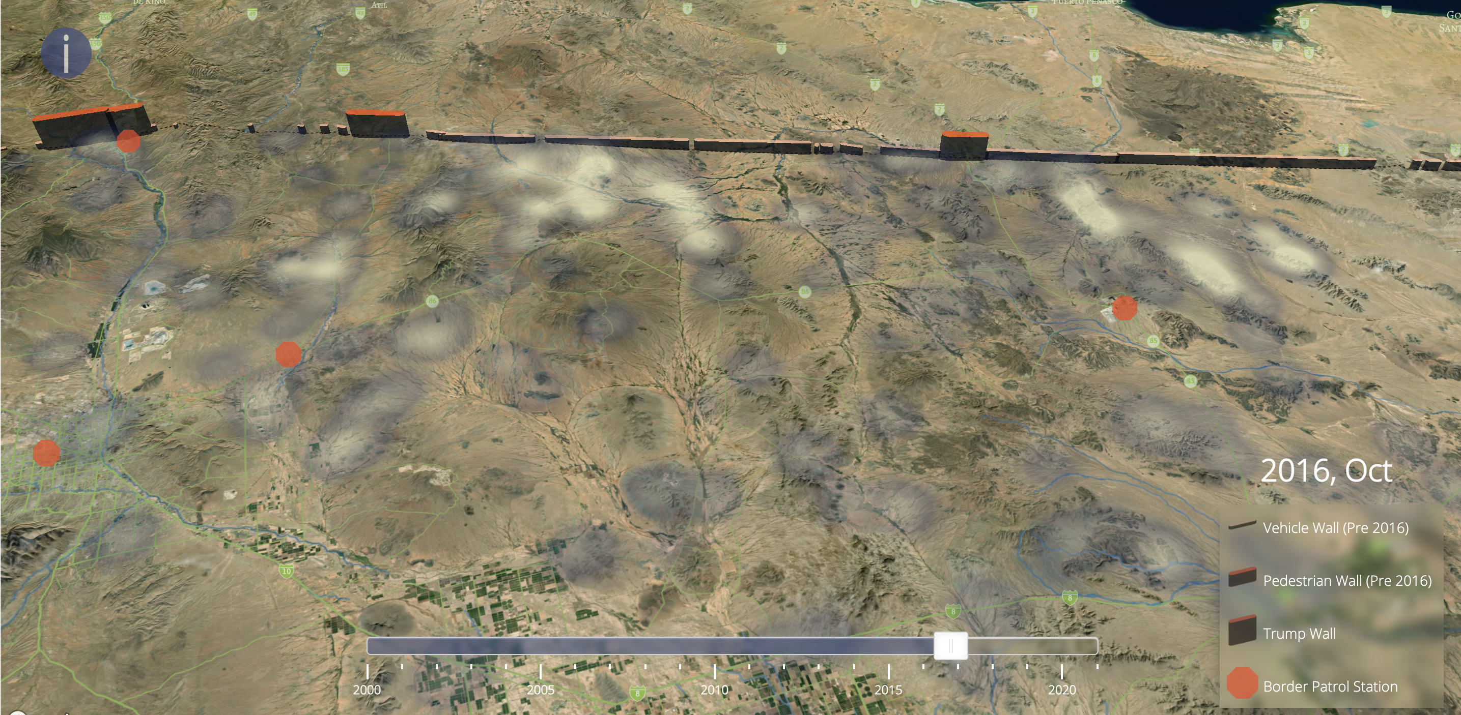
This is an animated map that shows the evolving geography of migrant deaths as new patrol stations and border walls are erected. Even though border crossers have significantly decreased in the past two decades, the number of deaths have not because border patrol have pushed migrants into increasingly remote and dangerous areas.
**
QGIS | Mapbox GL JS | Mapbox Studio | Javascript
GIS projects
OSM and PostGIS for vulnerability assessment
I used OpenStreetMap (OSM) and Tanzania Resilience Academy (RA) data to quantify a dimension of disaster vulnerability, and created a visualization at the sub-ward level to aid policy action. I specifically looked at the vulnerability caused by the build-up of rubbish in areas that are near existing drain blockages, but are inaccessible by vehicle. The geo-analysis was done using PostGIS.
**
PostGIS/PostgreSQL | QGIS
Comparing quality of DEM raster datasets
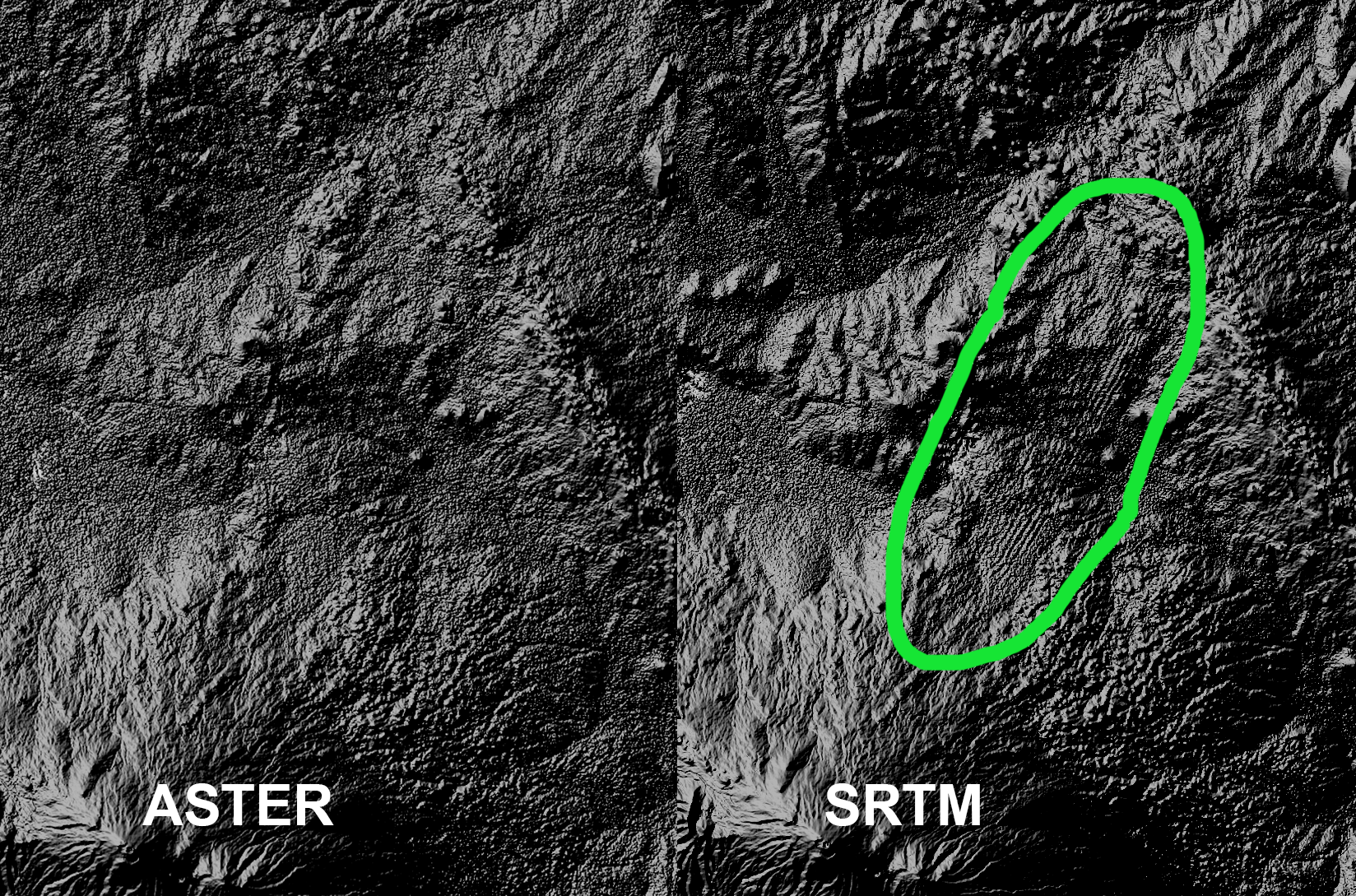
I compared the data quality of two DEM raster datasets, ASTER and SRTM in my study region of Mount Kilimanjaro using a terrain analysis program SAGA. I made sense of the areas of low resolution in the SRTM data by looking at its metadata (i.e. data provenance) and by considering the data capture method. I also analyzed how this raster error propagates when performing terrain analysis on the problematic regions.
**
SAGA | QGIS
Network, textual, and spatial analysis of Tweets
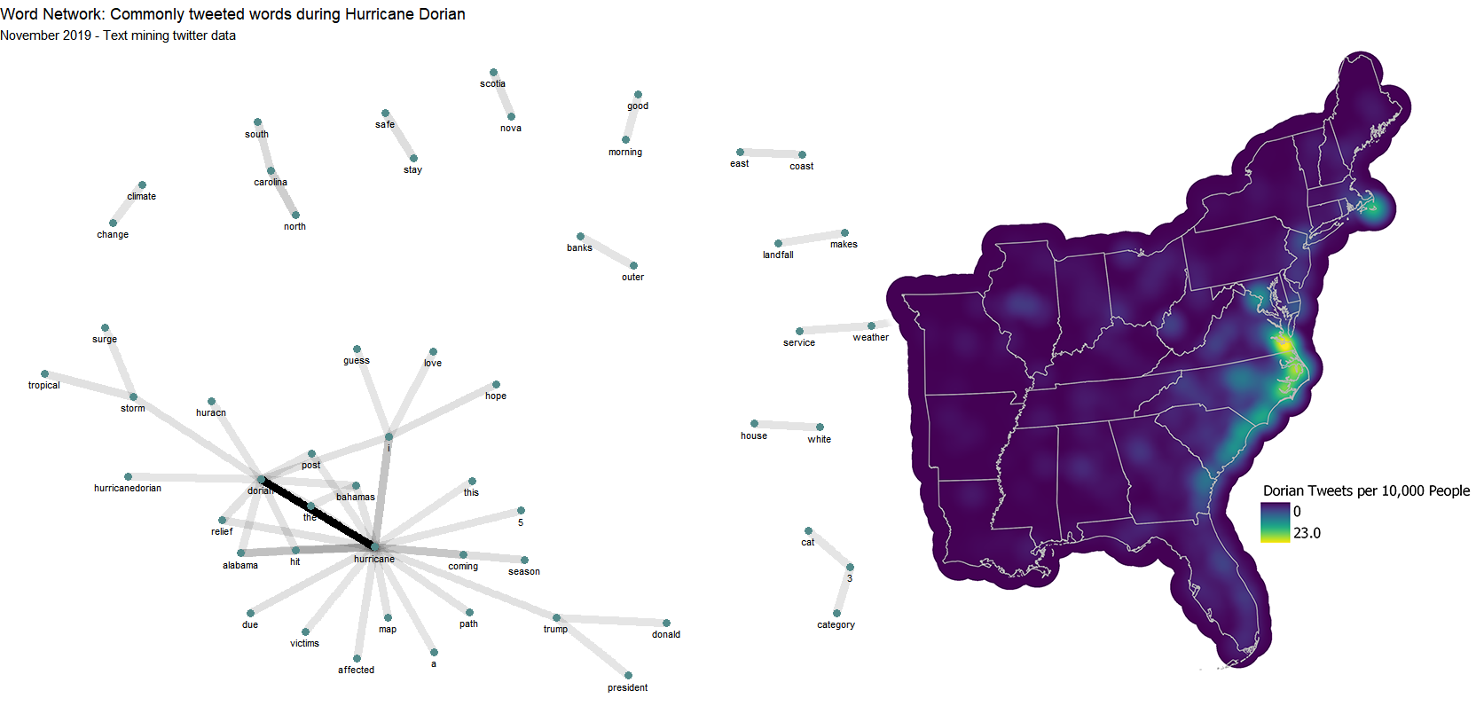
Geotagged tweets can be useful in the study of natural disasters and could potentially be used as a tool for emergency responders. I downloaded geotagged tweets to rStudio through the API to perform network and textual analysis and then used PostGIS and GeoDa to for spatial analysis. Specifically, I examined twitter activity during Hurricane Dorian that devastated the Bahamas and affected the East Coast of the United States.
**
R Studio | GeoDa | PostGIS/PostgreSQL | QGIS
Data anonymization vs uncertainty
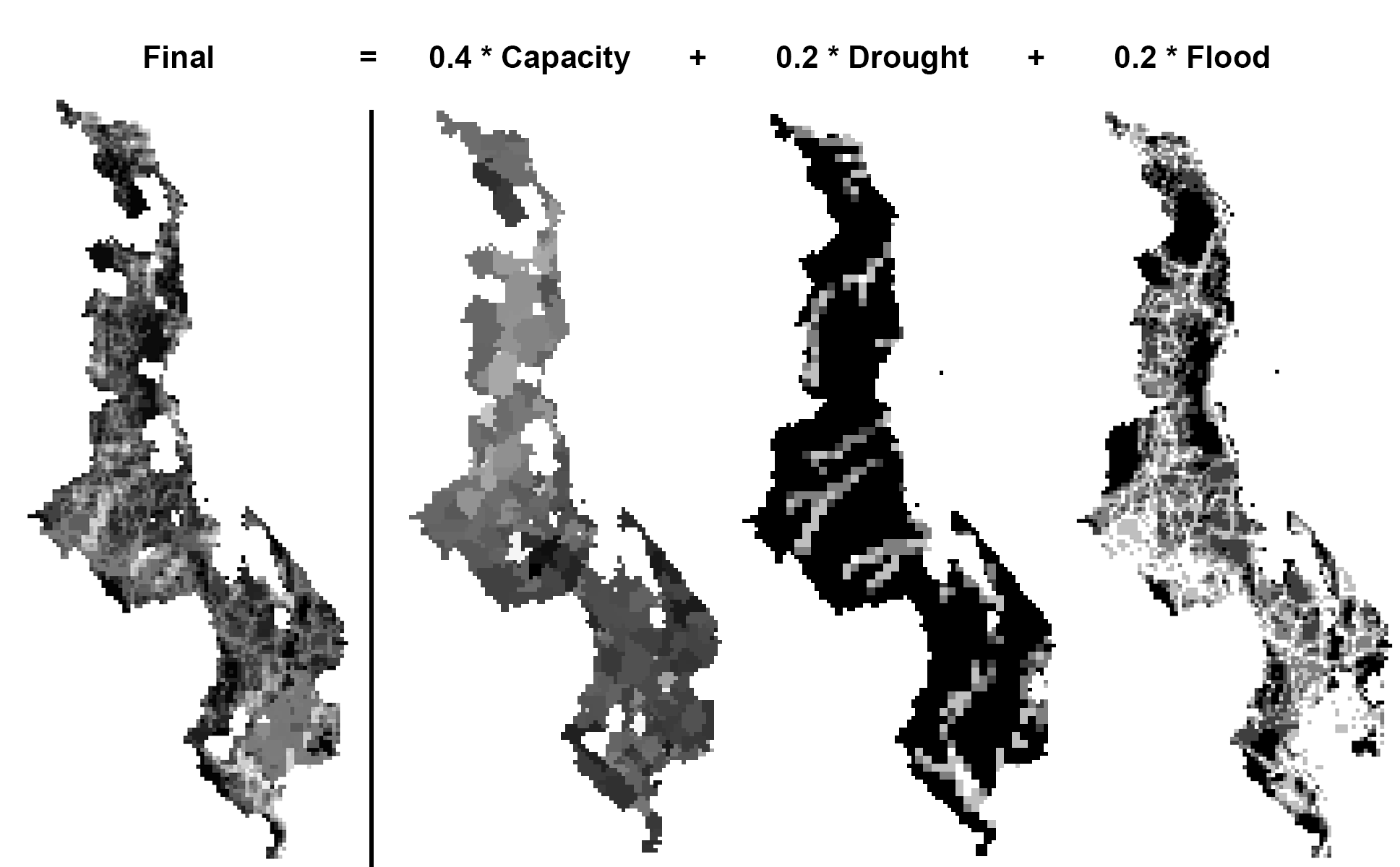
Reproducibility and replicability (R&R) are arguably the greatest issues that social science research faces at this moment. For an environmental vulnerability assessment that could spell the difference between a region receiving millions of dollars in aid or none at all, having a reproducible result is more important than ever. I look at how the authors of a Malawi vulnerability assessment fail to consider the uncertainty in their research results that arises from the spatial anonymization of DHS household survey data points, and how this could affect R&R of this research.
**
PostGIS/PostgreSQL | QGIS
Creating open source tool for QGIS
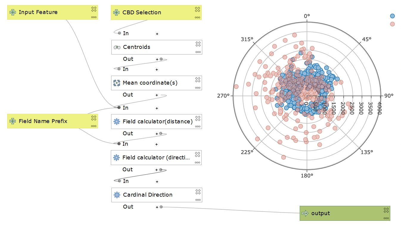
As an exercise and introduction to open source GIS, I made a QGIS model with an open source license and a help document. The model was designed to be used in urban geography analysis, specifically for distance-decay analysis that conceptualize the urban space as being organized radially out from the central business district. The tool calculates the distance and direction with respect to the central business district for each polygon in the input shapefile. I tested the model with census data and plotted it using DataPlotly.
**
DataPlotly | QGIS
Page template forked from evancaTheme by orderedlist